Colorful Quiet Luxury: The Interior Design Trend That Redefines Sophisticated Living
Colorful Quiet Luxury is taking the design world by storm — a fresh fusion of serenity and boldness, restraint and richness. At first glance, the phrase sounds contradictory. How can something be both colorful and quiet? Yet, designers have proven that these two worlds don’t just coexist — they elevate each other beautifully.
The idea began as a response to the dominance of moody interiors and the endless beige tones of minimalism. Colorful Quiet Luxury steps in as a graceful balance between understatement and personality. It’s refined but soulful, expressive yet calm. As designer Jen Baxter of Baxter Hill Interiors puts it, “It is refinement and restraint, but with personality and soul.”
In this style, every piece, every color, every texture has intention. The look remains elevated, never loud, but undeniably alive.
What Is Colorful Quiet Luxury?
At its core, Colorful Quiet Luxury is the art of balance. It’s not about throwing color everywhere or living in an all-neutral world. Instead, it invites soft, muted hues that carry depth and emotion. Livingetc’s color expert Amy Moorea Wong describes it perfectly: “It’s a path between bland beige minimalism and ouch-my-eyes maximalism.”
Think of it as minimalism with a pulse. This style keeps the craftsmanship and quality of quiet luxury but adds a layer of color that feels personal and timeless. London designer Nicola Crawford explains, “It’s the meeting point between serenity and self-expression through color and objects.”
So yes, Colorful Quiet Luxury is about being quietly confident — curating beauty without shouting for attention. It’s creating spaces that whisper elegance while celebrating individuality.
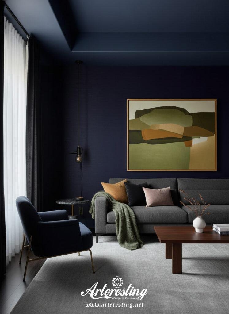
The Colorful Quiet Luxury Palette
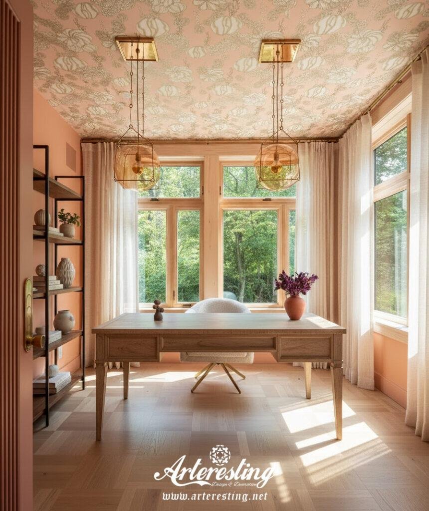
Now, what does this look like in color? Gone are the endless creams and grays. Instead, designers reach for mossy greens, earthy ochres, chalky rose, dusty olive, smoky blue, and soft black. These shades feel lived-in, rich with history, and effortlessly grounded.
Jen Baxter suggests focusing on “organic mid-tones” — hues that carry both softness and depth. The rule of thumb: avoid overly bright or synthetic colors. Every tone should feel natural, as if it already belongs in your space.
Amy Moorea Wong adds, “Instead of neutrals, neutrals, neutrals, we’ve arrived at something that feels warm, connected, and quietly expressive.” In Colorful Quiet Luxury, colors are chosen not to impress, but to express.
Styling a Colorful Quiet Luxury Interior
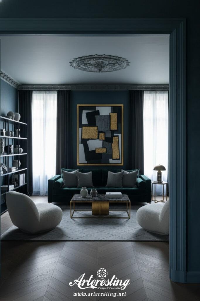
Achieving Colorful Quiet Luxury is an exercise in restraint. It’s about editing, not filling. Too many patterns or vivid tones can tip the look into maximalism, which breaks the calm balance this trend thrives on.
Nicola Crawford recommends thinking tonally: “Work with families of shades. Layer colors of the same tone to create depth without noise.” That’s how the space feels intentional, not chaotic.
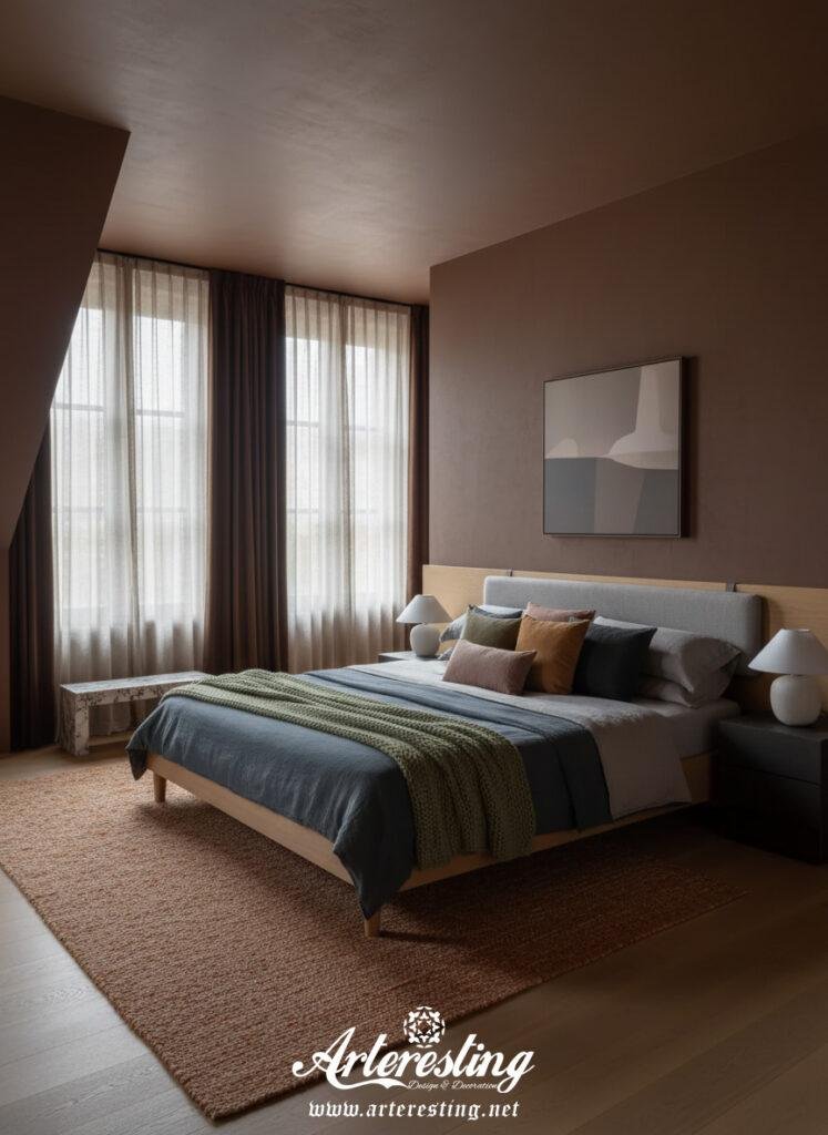
Each piece must earn its place. Curate — don’t clutter. Let negative space breathe life into your room. Choose craftsmanship over trendiness: a carved wooden chair, a handmade ceramic vase, or a vintage rug with history can add quiet beauty that mass-produced décor simply can’t.
Materiality also plays a starring role. Think of textures that tell a story — limewashed walls, soft marble veins, aged brass, natural wood. These details bring warmth and authenticity, grounding your color choices in tactile reality.
As Nicola says, “Find handmade ceramics, a vintage rug, bespoke joinery — these all bring soul to a space.” And she’s right: Colorful Quiet Luxury isn’t about perfection; it’s about presence.
Why Colorful Quiet Luxury Feels So Right Now
This aesthetic resonates deeply in our current design moment. Many are growing tired of sterile minimalism but still crave calm spaces. Colorful Quiet Luxury bridges that gap perfectly. It offers comfort, beauty, and individuality — all wrapped in sophistication.
Neutral tones still exist here, but they play a supporting role. They frame the rich colors, allowing the design to breathe and the hues to shine softly. The result is a home that feels elevated and alive — not loud, but full of quiet confidence.
For minimalists wanting warmth or maximalists craving calm, Colorful Quiet Luxury is the middle ground you didn’t know you needed.
In the End
Colorful Quiet Luxury isn’t an oxymoron; it’s a philosophy. It’s living with beauty that whispers instead of shouts. It’s the art of choosing colors that soothe the soul while celebrating craftsmanship and individuality.
If your home tells your story softly but vividly, you’ve already embraced the spirit of Colorful Quiet Luxury — and that’s the new meaning of true sophistication.
The post Colorful Quiet Luxury: The Interior Design Trend That Redefines Sophisticated Living appeared first on Arteresting.
Arteresting Bazaar


Comments
Post a Comment